Mies-Not
Will Galloway, Koen Klinkers
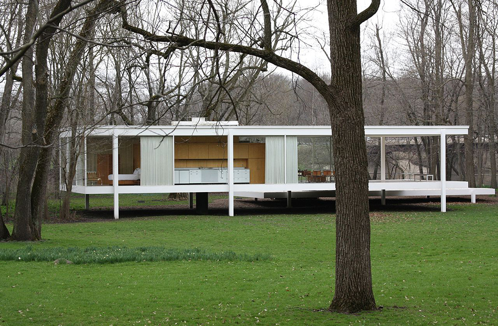
According to the myth of its creation the Farnsworth House was placed in the site by Mies so the location would enlarge the effect of the building.Made iconic by its perfect openness to the landscape, its success as architecture relies on how the site is treated.
How ironic that an exemplar of universal design, where external concerns are theoretically irrelevant, the home makes sense only in the singular location where it was built.
The role of landscape takes a different form in Tokyo but it is just as powerful.
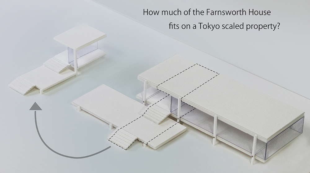
Searching for ways to come to terms with the modern city, we set up a literal and simplistic test. Transplanting the Farnsworth house into Tokyo, we find that only a fraction of this home - built for a single person - fits into a typical property.
We can accommodate pieces only. Some steps, part of the porch. On a larger site we might fit in a part of the kitchen. But nothing more. The Farnsworth feels like a retreat, it does not feel oversized at all. There is nothing grotesque about it. And yet the building alone uses an enormous amount of land compared to what is available in any modern city.
We can't copy the house directly. The connection between building and site is just as compelling though, even if the scale is impossible. Distortions of this “historical” architecture remain alluring. A piece of Mies might be better than none at all.
A tour of the world used to be about finding differences. Today we are forcefully reminded that cities look more and more alike, especially in newer areas. Tokyo is no different. Luckily it is large enough that the effect has some natural limits. It's hard to make a dent in a megacity. Outside the zones of generic construction there is still a particular landscape, low-rise, mostly filled with a dense seas of houses, shops and businesses even in the centres where global standards dominate. Occasionally the mat is lifted and mini-manhattan’s pop up to serve the financial services community, dominated by ex-pats who prefer to pretend they never left home. These areas are filled with tall buildings as expected of a world city. Yet it’s all built without fear or favour when it comes to style or intent, and in the end globalization is entirely swallowed by the city as a whole.
If we step back to a more basic point of view the fact that people are choosing to live in cities at all is somehow more interesting than what they look like. If we look backwards to the 1970’s and 1980’s, when Tokyo was reaching its pinnacle as a world power, the city was wilfully rejected by architects as a place to live in. The world’s first modern megacity was frightening, unfamiliar in its newness. People moved to Tokyo by the tens of millions, and architects built homes and places of work for them all. The timing could not have been worse for architects however. With money and work in abundance the profession had ironically just come to terms with its inability to plan large-scale utopias and instead felt a general unease about urbanism in general, and about the legitimacy of architecture at the personal level. Paradoxically this setting of uncertainty and growth gave us an introverted urban architecture that put Japan’s architects firmly on the world stage.
Given the times, the stance was reasonable. What urban architecture could honestly embrace the global uprisings of 1968, the OPEC embargo, the massive population growth and urban migration that was turning cities into a collective of isolation, every inhabitant a stranger? It is not surprising the architecture of the time took a consciously inward turn, abandoning urbanism as an idea and focusing instead on the poetry of interior space. For architects like Kazuo Shinohara the city became a place of beautiful interior landscapes of columns and platforms (curiously, this was also the case with the villas he built outside the city, where the need to hide away from context is less convincing). Toyo Ito built the most extreme example of the time in the form of a home for his sister, who was in mourning for the loss of her husband - to create perfect quietude he designed lyrically curved walls around an inner courtyard that was barely accessible, suggesting that even an enclosed outside space was not welcome. Building on this work Tadao Ando famously reduced the city to light and sky.
These choices were powerful and fascinating, but whatever the impulse driving them was, it has ebbed in the intervening decades. Nervousness about the city remains, but there is a growing feeling that the city is safe enough that it can now be treated as something legitimate, almost as welcome as a grove of trees.
One of our clients once argued that when they grew up in Tokyo it was normal to live with the city as part of daily life. Barriers between homes were a weak formality, allowing free passage between streets, gardens, and interiors. And between families as well. The lifestyle was entirely public. As they tell the story, when they grew older an influx of immigrants from outside the city changed their world in the 1960s. Unaccustomed and afraid of their new landscape they closed it down into introverted capsules, and built communities of strangers (and strangeness) as a result.
Their narrative is as good an explanation as any. Population in the centre unquestionably increased - from about 5 million in 1950 to 8 million by 1960, and has more or less held steady since then. Growth was even larger in the suburbs, expanding by 20 million between 1950 and 2000. In the city centre the physical change that went along with that growth was particular. Tokyo did not grow vertically, it subdivided. The size of land for sale became smaller and smaller as houses were torn down and replaced with smaller versions. Governments at every level allowed the change to continue, requiring only that access to light and fire safety was preserved. Decades later regulations of construction continue to be performance based rather than prescriptive, but the attitude has changed. The city is no longer a strange construct, but something familiar and customary, and the architecture is no longer so ruthlessly withdrawn. The question now - if the city is finally a legitimate landscape, what kind of buildings should we design?
So, Mies.
The modernism of Mies was vestigially classical, separating strategies between those of the city and those of the countryside. The language was less obviously divided however, and this seems something to consider. When the city is so dense that all space is at a premium the waste of isolating land by building walls is fantastic. A glass-boxed rural villa makes far more sense than a closed urban escape. The Farnsworth House in that case is the perfect model, but how well can it be transferred?
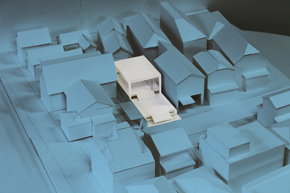
As a first step to test this thought we searched for a piece of land large enough to accommodate the entire Farnsworth house, but found it impossible. Land large enough to fit the entire house is almost non-existent. Even though the city was familiar to us this outcome was still a surprise. Continuing forward we shifted our approach and tested to see how much could of the iconic home could fit onto the sites of our recent work in Tokyo. Only fractions were possible. These pieces were in themselves fascinating as designs. They could almost be enough.
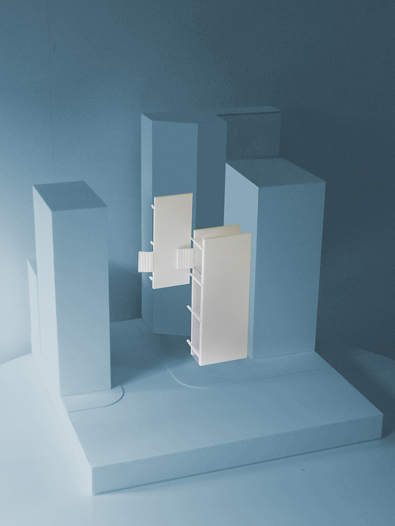
Still, the scale gap between Mieseian space and the Tokyo reality is enormous. Desiring the same openness we either need to invent a new language or manipulate the concept of free space in a more creative direction. Lacking access to actual space the inevitable choice is to stack floors and multiply the ground, giving priority to plan over form. New York rationality is not the point at this scale however. It makes more sense to avoid duplication of floors and instead treat each level as a distinct ground in its own right, and to find quality at that scale. The city overwhelms even skyscrapers in Tokyo. In which case, why not take advantage of what it offers?
